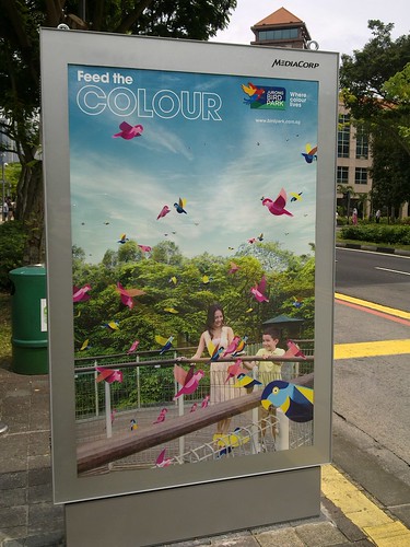
At lunch recently, I was attracted to this simple bus stop poster ad by Jurong Bird Park. Even though the copy isn’t factually correct (one can’t really feed colours), the metaphor associating avian species with their colourful plumage is cleverly and imaginatively conceived.
While text is kept to the absolute minimum, the brand imagery is clear. As most Singaporeans would know where the bird park is, there isn’t a need to include a map or an address in this poster.
Would such an advertising approach work for your business? If not, why?


