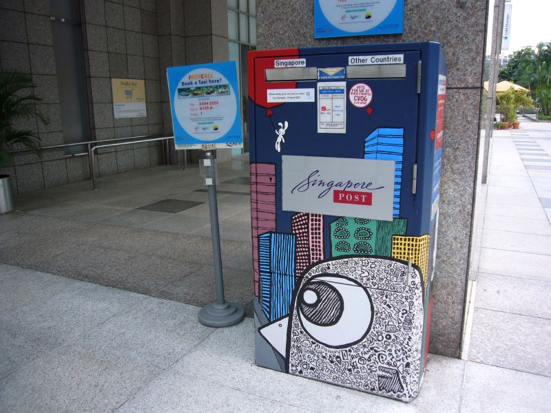
Spotted this funkily dolled up postbox just outside UE Square along Unity Road recently while waiting for my son and wife. Its a bid to add much needed colour, vibrancy and art to the city. Apparently, this is part of STAMP, a nation-wide competition organised by URA and Singpost which looks at making over 40 postboxes in the city.
Nice touch there which helps to rejuvenate the old and weary brand image of snail mail. After all, we do know that it is fighting a losing battle against email and other forms of online communications. These splashes of art certainly gives us more reasons to visit our mailboxes to pay our bills!
Now, if only they would do it for all the 800 postboxes around the island instead of just those in the city. That would definitely add a few notches in rebranding and repositioning Singpost as a creative and fun loving provider of an essential service.
Update: Saw that Sparklette also posted about this, albeit in a series!


A splash of colour is usually a welcome addition to a stoic backdrop.
But just last Saturday, I found my eyes taking a split-second more in spotting the postbox. I would appreciate a nice iconic, easy-to-spot postbox anytime.
There is more value in consistency (albeit “boring”) than many people think.
Wow i love the colours… So nice! So artistic! Something that would definitely catch my eyes!
This post reminded me of your earlier post on “pigging out”…
Only the external matters…they don’t care about the other 800 postboxes since there are not many tourists or foreigners in those areas.
Good point melvin, and one which drives the age-old debate between functionality and aesthetics. In a way, the postbox is the strongest brand symbol for Singpost and any postal service provider in the world.
On the other hand though, as you have explained, a little veering away from convention helps to make a brand stand out from amongst its peers. Especially one that has as old a brand heritage as Singpost.
Hopefully your bills didn’t get sent to Timbuctoo!
natasshea, nice right? do you have such art on the streets where you come from? I’ve always loved such little distractions from the monotony and humdrum of urban living.
tigerfish,
I guess its something that I hope we can change one day. In fact, focusing energies on your suburban and HDB based assets can be rewarding. If you visit most of the neighbourhood malls in Singapore, you will notice how much more crowded they are compared to those in the city centre.
always thought branding as having a consistent design so that it gets noted instantly.
however, the funky design sure blends well with the modern surroundings
so they’re are trying to achieve here? branding or blending (with the surroundings)? i wonder ….. hmmmmm