What people see when they arrive on your landing pages can make or break your conversion rates. Exclusive offers give you an opportunity to thank them for taking the time to learn more about your brand and entice them to try you just once.
The idea is that once they buy from you the experience will be so amazing that they’ll become a lifelong customer.
Special offers are an opportunity to push through inventory that hasn’t moved in a while.
You can use them to slash prices on a base product that people will purchase and then add to over time.
You can also plan your landing page offers to match different seasons, and create promotions based around different offers.
How Do I Make My Landing Page More Interesting?

Factoring in all industries gives you a 7.9% average conversion rate for landing pages. However, this varies depending on what you have on your landing page as well as the products you sell.
Different elements on your pages impact various people in multiple ways. For example, one person might react to a specific colour because they loathe the hue, while another loves that shade and is drawn to your brand.
How then can you showcase exclusive offers while making your landing pages interesting and attention-grabbing?
1. Narrow the Focus
It might be tempting to add tons of useful information to your landing page. After all, you need to sell the product or service, right?
However, that may not always work well on a landing page. You’re much better off choosing a single goal and pushing the user through the touchpoints to get to the objective.
For example, if you want them to make a purchase, simply add a huge call to action (CTA) button that reads, “Buy Now.”
Potential purchasers don’t want the distraction of a lot of information. They just want to buy and move on. It’s important to map out your buyer’s journey to figure out exactly what information is needed to trigger your visitors to make a final purchase decision.

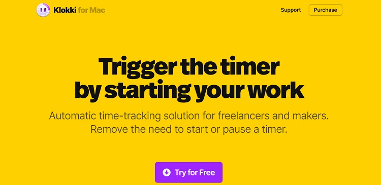
Source: https://www.klokki.com
Klokki is a timer for Mac users that helps freelancers and others to automatically track their time. Note the singular focus of their page and the simple “Try for Free” CTA button. They have a huge heading while the rest of the elements on the page point the user to a single goal. The offer to try it out without paying anything is an enticing one that may bring in new leads.
2. Create Individual Pages
A home page can certainly serve as one of your landing pages and should offer a generic way to move site visitors through your sales funnel.
However, you should also create individual pages for different audience segments. Have a separate page for each offer.
Consider creating specific pages based on the region where you’re marketing. Each landing page should address the unique contexts, concerns and challenges of customers in different parts of the world.
Creating the right number of landing pages also gives you an opportunity to better track which campaigns work best to sell your product, as well as how people react to different offers.
3. Offer a Code
When people land on your site, consider providing them with a specific discount code.
Be clear about what the offer covers. Is the discount on every product in your inventory, a single product or particular categories?

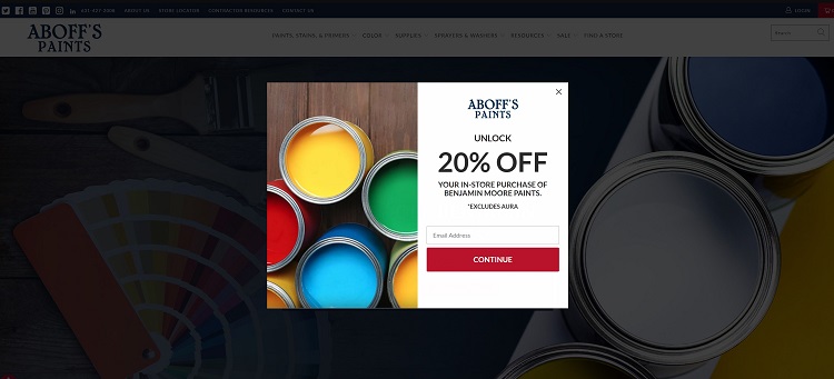
Source: https://aboffs.com
Aboff’s Paints offers a code for 20% savings if you share your email with them. Not only does this entice new customers to order their paint— the company will then have the person’s contact information and continue to market to them in future.
4. Utilize Colour
Colour can make or break the offers on your landing pages. Set them apart by choosing a contrasting colour not seen on the rest of the page. You want the offer to pop out so people notice it immediately when landing on your site.
Did you notice in the Klokki example above how they had a beautiful bright yellow color scheme and the CTA was a pop of vivid purple? Where was your eye drawn? It likely went right to the purple button.
5. Add Videos
Wyzowl talked to 582 respondents made up of marketing professionals and consumers. They discovered 88% of people want more videos from brands in 2022.
If you don’t already utilize video on your landing pages, now is the time to start. You can share a lot of information in a short clip that drives conversions.

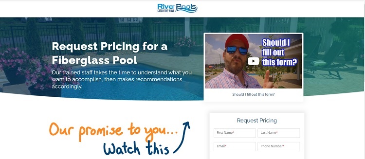
Source: https://www.riverpoolsandspas.com/request-a-fiberglass-pool-price
We love this video offer on River Pool’s landing page. The headline is kind of quirky and fun, which helps to make you think about good times and fun. Then, they encourage you to go ahead and request a price from them while explaining the benefits of choosing them over competitors. This is an excellent way to capture leads from a landing page.
6. Choose Pop Ups
You’ve probably heard both schools of thought on pop ups.
Some people love them and some hate them. At the end of the day, though, they can be quite effective if they aren’t annoying. A pop up reminds people there’s a special offer, that it’s time limited and how to take advantage of the sale.
You can also make the pop up occur to the side or when the person first arrives or gets ready to exit. Set it to not keep popping up once dismissed but you could leave a small icon so people can find it again.
Try Different Ideas
Ideally, you can try different methods of showcasing your offers on landing pages. See what resonates best with your target audience.
A pop up might work great for the little boutique clothing reselling but not so well for a business to business software as a service model.
Because each business is so unique, you have to figure out what works best for you and your customers.

Eleanor Hecks is editor-in-chief at Designerly Magazine. She was the creative director at a digital marketing agency before becoming a full-time freelance designer. Eleanor lives in Philly with her husband and pup, Bear.

your post is so useful