On the world of advertising, three posts in particular hit me recently. All three looked at the various visual and verbal effects of advertisements and their relative impacts on a consumer’s response.
The first is by Vivienne of Versa Creations, who shared about Ikea’s latest advertisement which apparently confuses more than it convinces with poorly taken pictures. Have a look at the advertisement below to see what I mean:

Courtesy of Versa Creations>
Being a great fan of Ikea’s advertisements, I was rather disappointed by this latest incarnation. In Vivienne’s own words,
“I couldn’t believe my eyes when I first saw this ad.
Messy.
Untidy
Poor choreography.
Ironically, the headline said ‘… it’s more about creativity and coordination’.”
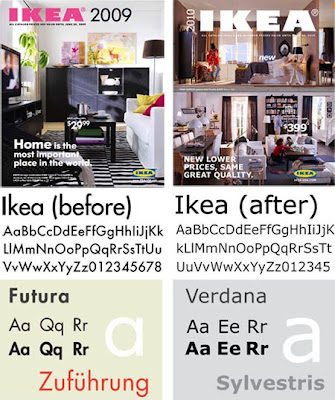
Apparently, Ikea’s troubles are not merely limited to its photographs but its typography too. Kevin Roberts of Saatchi & Saatchi shared that the company’s change of fonts have resulted in an uproar amongst its many fans. Have a look at the new Ikea catalogue below and the change in the fonts used:

Courtesy of idsgn
Seems to be just a small matter right? Wrong. By switching from Futura to Verdana, Ikea has alienated its global design fans. This has even resulted in an online petition (now 6,387 signatures) created to protest against this decision. Kevin hit the nail on the head by sharing that “Brands are not owned by management. They are owned by the people. Designers have been vocal advocates for Ikea’s stylish yet budget-friendly products. And now they feel betrayed.”
While the picture may paint a thousand words, it is often the copy in ads and their relationship to a powerful visual which leads to success. This is the point of a second post from Branding Insider by marketing guru Al Ries. In it, Al explains that the visual is the “hammer” while the words are the “nails” in an advertisement. To succeed in leaving a significant impact in the hearts and minds of consumers, both graphic designers and copywriters must work together. In his own words,
“…a visual alone is not enough. You need to connect the visual to a powerful verbal statement. When the two work together, when you have an exceptionally powerful hammer and an exceptionally sharp nail, the results can be astounding.”
Citing the example of BMW, Al declares that the use of the tagline “Ultimate Driving Machine”, great copy and strong and stirring visuals helped propel the German carmaker to outsell Mercedes globally. While Mercedes uses the tri-star logotype as its main brand visual, BMW deftly combines both image and text to move the hearts and pockets of its prestige conscious customer. An example can be seen below:

Courtesy of Branding Strategy Insider.

I didnt know IKEA had so many hardcore fan… impressed at the number of people who actually petitioned!
I really like this post. It quite resonates to the advertisments in Italy – its so crowded and too much information that I dont feel compelled to read it.
A powerful advertisment should be one that brings in the reader not push them away.
Now I feel motivated to blog … hehehe
wow walter, i didnt know you have such considered views abt advertising too … not just heritage and travel … anyway brought back memories of my early years in advertising industry … to me the answer should be “both” .. neither comes first , as picture and words work seamlessly together to communicate the creative idea … to borrow from Lao Tzu , both are but manifestations of the Tao 🙂
well, at least ikea did leave an impact after all with the changes …… hehe
Creative adverts are fun to watch. The latest one by Heineken about a group of men who went wild over the ‘beer parlour’ is really funny. The men’s acting was really good. But my personal favourite is the Ikea ad which I titled; 东西在哪里.
Brand are not owned by the management; but owned by people – is so true. Designers and copywriters need to understand the kind of image that brand has in their minds and live up to it.
Thanks for the post!
who cares that much about a company’s font that they go online and sign a petition? That just seems so weird to me.