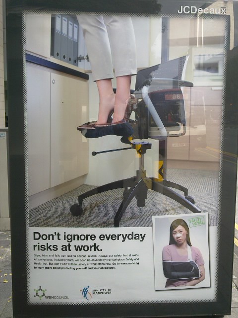
As I was walking to work recently, I couldn’t help noticing the following workplace safety advertisement on a bus stop shelter (I have a peculiar habit of noticing outdoor advertisements of all shapes and sizes):
Put up by the Ministry of Manpower’s Workplace Safety and Health unit, the poster had a simple and succinct message reminding everybody to be careful and to take care of themselves. This is important as some 29 per cent or 3,000 workplace injuries last year were from non-factory industries like retail, entertainment and services.
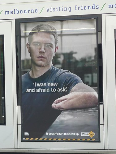
While the advertisement did work (at least for me) with its straightforward message and clear visuals, I couldn’t help noticing how alike (yet different) it was compared to a similar campaign last year in Melbourne put together by Worksafe Victoria.
Back then, I blogged that shocking visuals could be a way to get a message across in a cluttered advertising scene. Of course, the Victorian government took a more graphic approach to safety at work.
Which approach would work better for you and why?


I think looking at the consequences is more scary than looking at the act itself.
Usually graphical display for employees injuries are not easily found. Hospitals are tightlipped about patient’s info and employers of the patient are more likely to keep it low key. The truth is always more painful.
They are very different posters because their audience are different. The shocking poster would work only if they’re placed near factories, and totally ignored in the city areas where everyone’s conditioned to tune-out grotesque images because of all the anti-smoking & anti-malaria ads.
Having said that, the first poster by the MOM would probably be ignored as well because no one really look at posters without beautiful people or things these days.
Safety should really be addressed through training instead of posters.