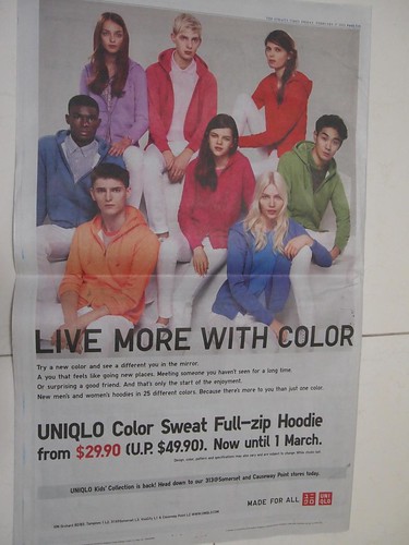
As I was flipping through the newspapers one morning, my wife pointed out that the advertisement which Japanese clothing brand Uniqlo placed (above) was different from most other clothing retailers.
First, it focused on a single product category and showcases the range of colours and styles available. Uniqlo is clearly targeting those looking for sweat shirts with hoodies. This singular focus will appeal to customers in this category.
Often, garment retailers tend to “maximise” expensive real estate on a full page full colour newspaper press advertisement with as many products as possible. By doing so, they hope to attract a wider range of customers looking for different ranges of apparel to mix and match their wardrobe. However, this may end up confusing customers or make their adverts too cluttered to capture readers’ attention.
Second, it is clearly “on-brand” by featuring models of different ethnicities (with a slight Euro-centricism favoured by Japanese tastes), all of whom are young and attractive. The way the shoot is art-directed clearly follows a certain brand sensibility, with the models looking directly at the camera (and at you), instead of each other.
Third, the value proposition is clearly communicated with the expiry date of the offer in place. There is no store-wide sale nor multiple discounts for different credit card holders. Instead, in an almost Zen-like simplicity, customers can enjoy a significant offer for that product being showcased, available in the range of colours and styles as depicted.
While the price of the hoodies are remarkably affordable at S$29.90, one doesn’t get the feeling that these are “cheap” items by the way the advertisement is presented. Marrying strong design aesthetics with a value-for-money price, it is little wonder that Uniqlo is growing so rapidly around the world, giving other fashion brands like Zara a run for its money.
Are there other lessons that we can learn from Uniqlo?


Reminds me of a Benetton ad