
If you’d like your website to convert visitors to customers, you need to start with an effective website wireframe.
Sure, the aesthetics and design of your website is important. After all, these colours, images and motifs convey the “feel” of your brand.
However, it is the words that you place on your website which determines if a visitor will click on a Call-To-Action (CTA) button or do business with you.
In this article, you will learn how to wireframe a website with the winning framework taught by StoryBrand’s Donald Miller and Dr J.J. Peterson in their book Marketing Made Simple—A Step-by-step Storybrand Guide For Any Business.
(You can download an entire copy of the eBook for FREE here or buy one from any store.)
What is Role Should Your Website Play?
A critical part of the sales and marketing funnel in digital marketing, your website or landing page should be a place where you sell your customer a product that solves their problem and makes their lives better.
Ask yourself these questions BEFORE you design your website:
- Who are the customers whom you’re targeting?
- What is the problem that you solve for them?
- How does your customer feel after you solve their problem?
- How does a prospect buy your product?
- What value can you add to your customer’s life when he or she buys your product?
The best way to incorporate these elements is to wireframe your website.
Introducing Website Wireframes
A website wireframe is a skeletal framework which lays out the different content sections and functions on a website before it is designed.
It is often laid out as a long digital document (or a long piece of paper) which includes the text, boxes, illustrations, buttons and other components of your website.
I like to use a simple Google Doc to create a wireframe—multiple parties can work on it, and you can easily write all the text you’d like or incorporate visuals that are appropriate. However, you can also use tools such as wireframe.cc, Balsamiq, Figma or others.
The beauty of a wireframe is that it helps you to get feedback before you spend time, money and energy on designing a website.
Here’s an example of how a website wireframe looks like:
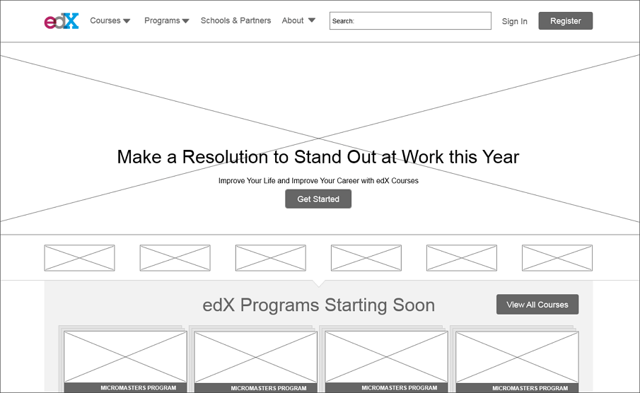
Courtesy of mockplus.com
The Nine Sections of a Winning Website
So how do you build a website that—to quote Miller and Peterson’s book—helps to “increase sales time and time again?”
According to their book, it involves these nine sections:
- The Header: This is the first few words at the top of website which conveys your offer
- The Stakes: The section where you explain what you are saving your customers from
- The Value Proposition: What are the benefits that your product or service provides? List them down
- The Guide: Here’s where you introduce yourself as the brand or person who can solve your customer’s problem (read my Storybrand review for more info on this.)
- The Plan: Tell your prospect what they must do to do business with you and solve their problem
- The Explanatory Paragraph: This is a long-form BrandScript in which you invite your customers into the story—its also where you put in your SEO keywords
- The Video (optional): A video can help communicate your message to those who prefer to watch then to read.
- Price Choices (optional): Consider listing down the different products or services which you offer—or the categories if you’d like
- Junk Drawer: This is the most important part of your website because you’re going to list everything you previously thought was important
Let’s dive into each of these sections below.
1) The Website Header
First impressions last. The first 10 seconds that a visitor lands on your website will determine if he will stay or go.
To keep them reading and scrolling, make sure your website passes the grunt test—answer these 3 questions in the header:
- What do you offer? Describe your product or service succinctly.
- How will it make your customer’s life better? Highlight the strongest benefit.
- What does he need to do to buy it? Include a clear and direct CTA button.
Put all these together into a single statement, and include a clear and direct CTA button. You may also include a “Transitional CTA” which is a CTA to a lead generator (eg “Download eBook” or “Watch Video” or “Get Sample Content”).
Here are some examples:
- Injury lawyers committed to helping you get your life back –> [Book Call]
- Turn your Facebook, Instagram and LinkedIn accounts into money makers –> [Schedule Consultation]
- Boost your energy and transform your health without drugs or exercise –> [Book Session]
You can place these elements in a design that looks like this, with the CTA buttons in the Z-shaped direction where the eyes are drawn to:
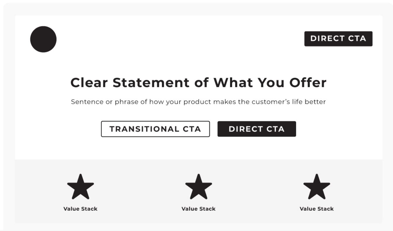
Courtesy of Marketing Made Simple book
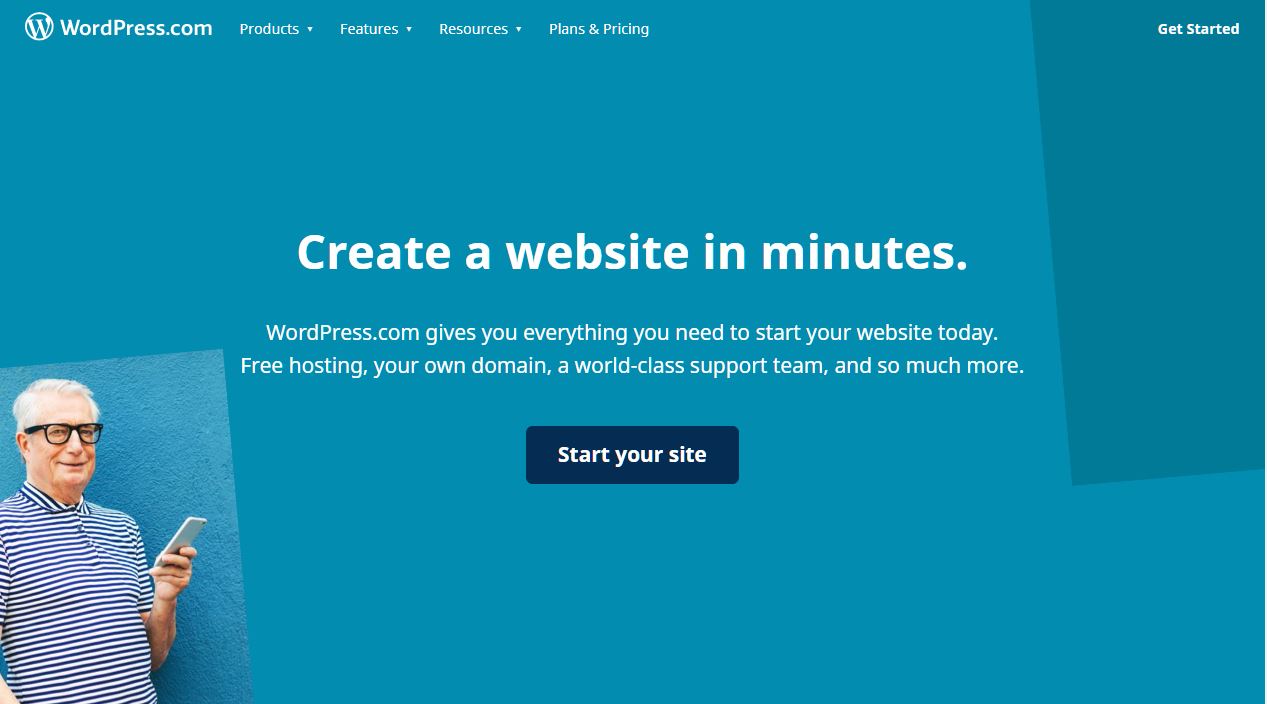
Beyond these, do also consider the images here—avoid sliders (ie carousel images) which have been shown to have little effect. Instead, consider looping images (silent film) ensuring taht your text floats over the images in a fixed position.
Here’s a good example from WordPress—notice the image of the elderly gentleman whom they’ve used? What message are they trying to convey here?
2) The Stakes
Also known as the “Failure” section, this is where you describe what happens if your prospect chooses not to do business with you.
Describe the pain that they stand to experience in terms of the following:
- Continuous embarrassment
- More time wasted
- Lost business or social opportunities
- Lack of energy
- Confusion and chaos
- Loss of status
- Not reaching their potential
- Lagging behind the competition
- Being ridiculed in life or at work
- Inability to achieve positive results
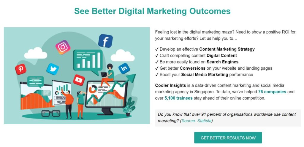
List them down as bullet points or use icons to represent these problems or pain points. Here’s how we’ve communicated it on the Cooler Insights website:
3) The Value Proposition
This is a description of the value or benefit which your customer can get from you:
- How they can save money
- How they can save time
- How they can improve work/ life
- How they can reduce risk
- How they can increase sales
- How they can strengthen quality
- How they can simplify their life
- How they can avoid hassles
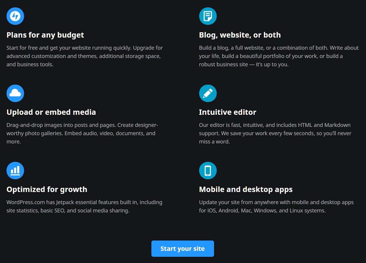
The more specific and visual you are here, the better it can be. And yes, it helps if you can put in a Headline here to exemplify your core value.
Here’s a good example from WordPress’s website:
4) The Guide
This is the section on your website or landing page where you’ll want to exhibit both empathy and authority.
The one-two punch of empathy and authority ensures you can connect with your audience while demonstrating competency. This is important to build trust in them.
To communicate authority on your website, use the following:
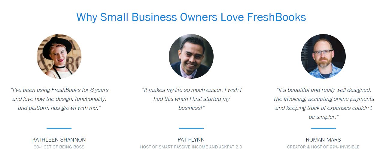
- Testimonials—keep them short and scannable, and try to make them specific to the problems your business solves or the value you bring
- Logos of companies you’ve worked with
- Simple statistics on your business growth
- Media mentions and features
Here are examples of great testimonials from FreshBooks website:
Here’s an example of authority-building logos from our Cooler Marketer website:
See another example of statistics below from Shaws Preschool:

What about empathy? To resonate with your client, complete this sentence: “we know what it feels like to ________________.”
Here are some examples:
- As a small business ourselves, we know how challenging it is to grow online against larger competitors
- I know how it feels like to be passed over for a promotion because I’ve experienced it in my own career
- Like you, we’ve had sleepless nights worrying about our online sales—until we did this…
- We are ladies and gentlemen serving ladies and gentlemen (guess where this came from?)
5) The Plan
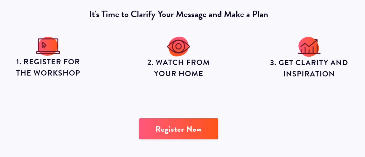
This is where you provide a 3 to 4-step plan for your customer to take. Doing so helps to communicate to your customer that doing business with you is as easy as ABC!
Here is an example which involves three steps, and could be used for a fashion retailer of office apparel:
- Give us your measurements
- We will mix and match styles for you
- Dress to impress
Here’s another example from the StoryBrand folks themselves:
For an added boost, you may wish to include subtitles below each step to describe their benefits.
6) The Explanatory Paragraph
This is the section where you’ll put in the Search Engine Optimization (SEO) elements on your website. It is a long-form text that does the following:
- Identify who your customer wants to be
- Identify what they want
- Define the problem setting them back
- Position you as their guide
- Share a plan they can use to solve their problem (which includes your product)
- Call them to action
- Cast a vision for their lives
Here’s a sample explanatory paragraph format that you can use.
At _________ [your company name], we know you are the kind of people who want to be ___________ [ aspirational identity. What kind of person do they want to become?]. In order to be that way, you need ___________[As it relates to your product, what does your customer want?]. The problem is ________[What’s the physical problem holding them back?], which makes you feel ________[How is that problem making them feel?]. We believe ___________[Why is it just plain wrong that anybody should have to deal with that problem?]. We understand __________[Include an empathetic statement]. That’s why we __________[Demonstrate your competency to solve their problem]. Here’s how it works ______________[What’s your three-step plan: step one, step two, step three]. So ___________ [Call them to action], so you can stop __________ [What negative thing will happen or continue to happen if they don’t order?] and start _____________[What will their life look like if they do place an order?].
As this is a fairly long-form piece, you need to write and rewrite it until it reads smoothly.
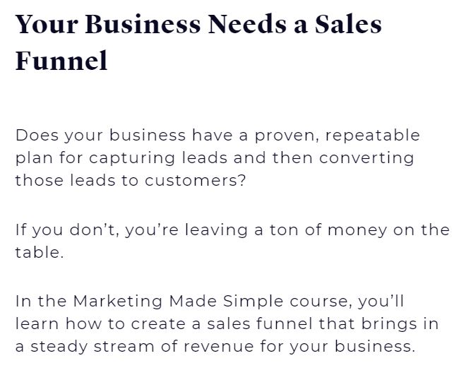
Here’s an example taken from the Marketing Made Simple landing page.
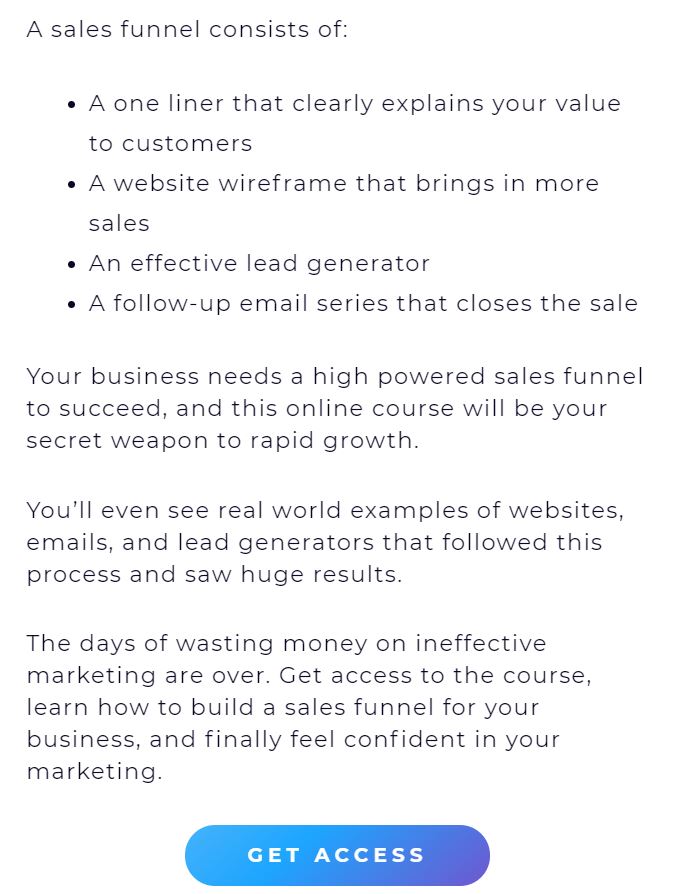
Another example of an explanatory paragraph is to answer your customer’s objections. This can be done in an FAQ style.
7) The Video
This is a supplementary portion to help communicate your sales pitch. The idea is to repeat the same words in your video that is on your page.
Here are some best practices suggested by the book:
- Keep it short: At best, it should not last more than 3 minutes
- Hook the viewer: Grab the attention from the first 10 seconds of your video, and state the problem your customer experiences as soon as possible
- Consider a longer version as a lead magnet: If you’d like to collect your customer details, consider including an opt-in form in exchange for the video where you’ll teach something
- Video title: Make sure that the title grabs their attention, eg “How we’ve helped over 3,300 trainees improve their marketing”
Learn more best practices in video creation here.
8) Price Choices
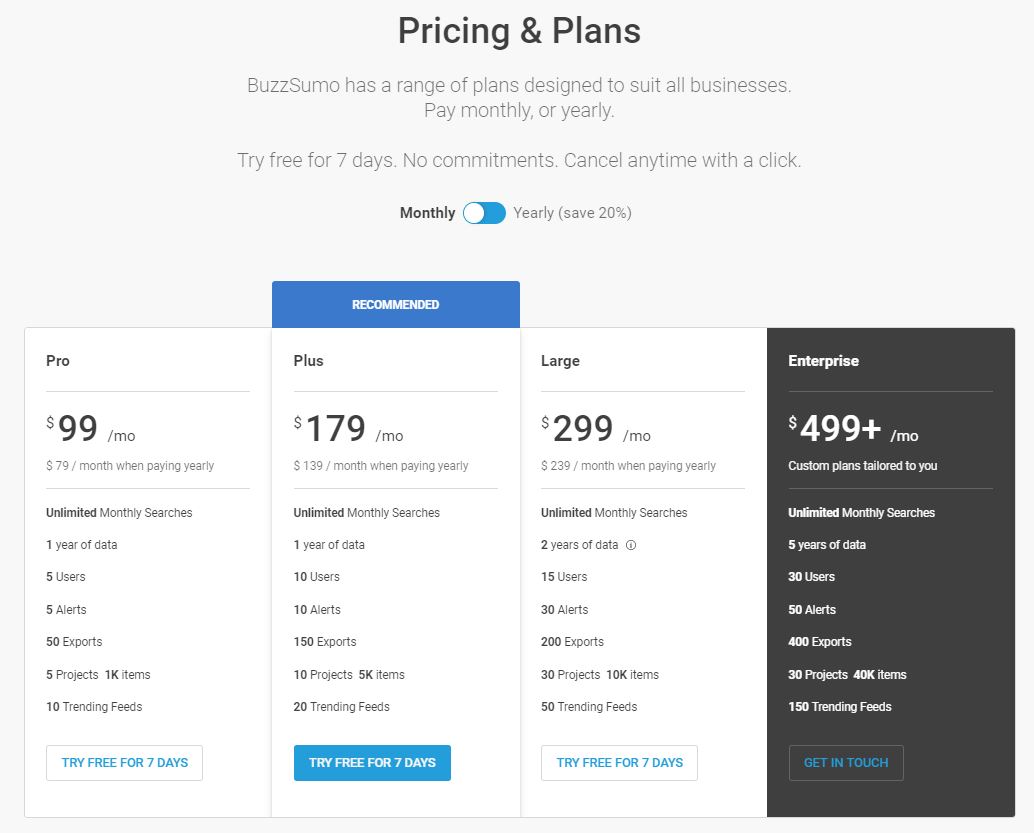
This is another option for companies that have a fixed cost on their website. For those who don’t, it may be useful to bundle your products or services into different packages.
Studies have shown that people tend to choose the middle option if they’re given three price points.
Here’s an example of how this can be presented from BuzzSumo:
9) Junk Drawer
Now this is where you’ll put everything else which you previously thought was important! And they’ll include many of the navigational sections such as the following:
- About Us
- Employment
- FAQs
- Privacy Policy
- Media
In short, it is the footer of your website.
Conclusion
Building an effective wireframe for your website helps to transform your landing pages into sales-growing platforms.
Thanks to Marketing Made Simple, we now have a more effective method of building landing pages that helps to improve conversions.
To learn other techniques and strategies to improve your website conversions, do read these articles:
