Do you have many different pages on your website requiring quick navigation? If so, consider designing a mega menu for your website!
A website mega menu breaks down various categories and subcategories to give you the perfect navigational point for your site visitors. They work particularly well as sites grow and expand.
If you have a lot of content or sell products in a wide range of categories (like an eCommerce store), then a mega menu is almost a must.
In a recent survey, researchers found 38% of people look at a website’s page layout and navigation the first time they visit. The navigation (or nav) bar helps acclimate them to what’s available and serves as a marker as they move throughout the site.
With this mind, a mega menu forces you to create main categories and figure out what fits under each.
Do you think your site might benefit from a mega menu now or in the future? Here are the steps to design the perfect mega menu for your website!
1. Choose Your Categories
Ideally, the fewer categories you have, the better. However, you also need enough to segment your inventory into sections.
Think about the common things people ask for and how they fit together. Your sections must be broad enough to cover all your topics, but narrow enough to guide the user where they need to go.
You also must have some foresight and figure out what subcategories you might need to add in the future and if your categories are broad enough to account for brand growth. Check larger competitor sites to gather ideas.
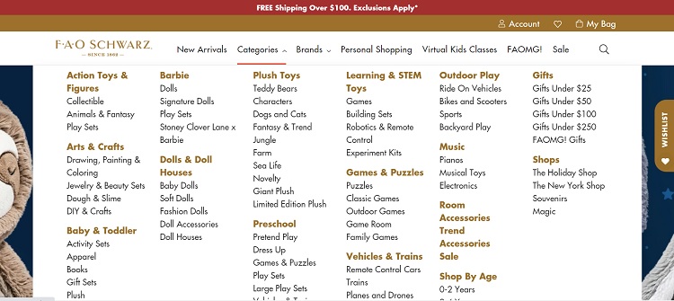
FAO Schwarz uses broad topics, such as Arts & Crafts and Games and Puzzles. Many different subcategories fit under each of those larger sections. They can easily add sub-subcategories as well, such as “baby puzzles” and “adult puzzles.”
2. Consider Icons
One of the biggest advantages of a mega menu is that it provides more space for you to add elements such as images and icons. Although not every navigation benefits from such features, you can add a lot of personality.
For example, you could add an icon to give a visual cue for each category. Another option is to add symbols such as stars or arrows to highlight popular products.
3. Utilize Relevant Images
With a mega menu, you have room for images. You can even use visuals as categories to better guide the user. Photos can be placed to the side to enhance what the user processes or uses in specific locations on your website.
The images you select should be high-quality, relevant and unique to your business model.
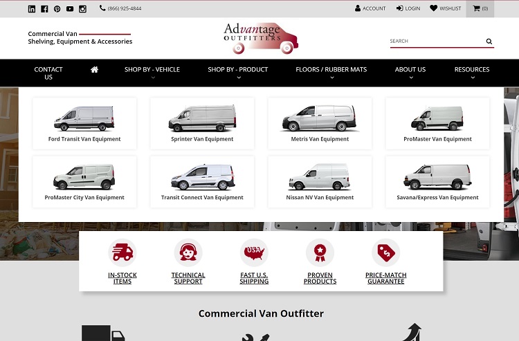
Advantage Outfitters does a great job by featuring two separate mega menus.
One is for vehicles — users browse through images and names of different work vans to select the one they own. The other menu breaks down their products into categories, such as rubber mats or shelving. Appropriate image help to signpost the relevant item but you must click on each to go to a full list.
4. Cut the Clutter
Just because you have more space to list items doesn’t mean you should add things you don’t really need. Think about your goal for the site.
What do you want your visitors to do? Are there any extra categories you don’t need or can be combined with another? Do you really need A and B or can B fall under A?
Ask for feedback from your customers and see if there are any areas they don’t use or think aren’t needed. Consider the pain points customers most frequently have and hone in on those.
5. Make It Expandable
When you offer a wide range of products and services, expanding each menu rather than doing a simple drop down is preferable for users to get the full scope of what you do. Nielsen Norman recently reported hover dropdowns should take about .5 seconds to appear on mouse over.
You can also use an arrow and have the person click on it to pull up the mega menu.
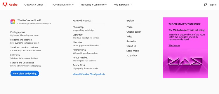
Adobe uses the click method. The mega menu appears after the user clicks on the downward arrow for the category. Note how they have three main sections and then subcategories. Within each subcategory is a list of software to match for photographers, videographers and more.
6. Consider Mobile
Keep in mind that many of your site visitors may come to you on their mobile devices. If your mega menu doesn’t adapt to their smaller screens, you may lose them to a competitor. How then can you scale a mega menu down to a mobile-friendly size?
You may want to go with broader categories, added search functions or ask the user to click through to get to the exact section they want. It won’t be quite as intuitive as the desktop version, but is needed to keep from taking over their entire screen.
7. Use Columns
Columns can be a neat way of separating your secondary categories into sections and listing out your finer detailed items without losing space. On a desktop mega menu, you can easily fit four or five columns across.
Use type hierarchy to show which items are top level, such as bolding subcategories and having sub-subcategories in regular text.
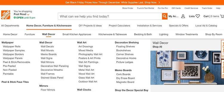
Home Depot offers categories such as Home Decor, Furniture and Wall Decor. As the user scrolls across them, a mega menu opens with four columns of subcategories. In the fifth column is an image to indicate what the section covers. Note how the subcategories are in bold to indicate their secondary level.
Should You Use a Mega Menu?
If you have more than five categories, it might be time to break them into subsections to create a better structure for your site.
Mega menus aren’t only for monster sized sites. They can work equally well to divert users to the section where you want them to go.
Try different combinations until you land on the one giving you the best conversion rate.

Eleanor Hecks is editor-in-chief at Designerly Magazine. She was the creative director at a digital marketing agency before becoming a full-time freelance designer. Eleanor lives in Philly with her husband and pup, Bear.
