
Do you know what the footer of your website is? Its that little section at the bottom of your website.
The footer of your site is often an overlooked space. After all, many users move on to another section of your site before reaching the end of any page…
Yet, you can still have a huge impact via what you place in the footer, including the information people specifically go there to find.
Even though the footer is often overlooked by designers, you can fulfill some very specific site visitor needs, depending upon what you place there.
What works best also depends on the type of industry you’re in. For certain tightly regulated sectors, the footer needs to convey important legal clauses and terms and conditions.
Curious to know what you should include in your website footer?
Here are the top elements needed in all website footers along with some examples of companies utilizing the space to their best advantage.
1. Share Detailed Information
You might think the footer is only for links to other spots on your site or contact information, but you can use this space to go into further detail for those who’ve made it all the way down your page.
Some types of businesses, such as restaurants, are particularly well suited to using the footer to show specials or menu items, for example.
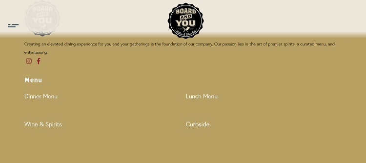
Board & You Bistro and Wine Bar uses their footer to link to their dinner and lunch menus. They also offer details on their curbside ordering and links to their social media pages. By keeping the info in the footer to a minimum, the brand places the emphasis on the details of the food.
2. Contact Info
In many cases, adding contact information in your footer is a given. People will even hit Ctrl + End to reach the bottom of your page and find your address or phone number. If you run a brick-and-mortar store, event venue or office space, for example, people may need directions to where you’re located.
Adding contact information in an easily accessible spot also adds a level of trust to your brand. People see they can get in touch in multiple ways and are more likely to believe you’ll follow through should there be an issue with your product or service at some point.
3. Call to Action (CTA)
The call to action should focus on the goal of the page, but there’s no reason you can’t add a final CTA in your footer. What is the overarching purpose of your site? Include the CTA for your objective at the bottom of every page.
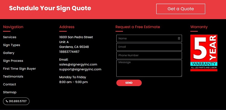
Signergy puts a free estimate request form right in the footer of their design. By filling in a few quick form fields and hitting the button, visitors can request a quote. Since those wanting a quote are likely to scroll to the bottom to find a phone number, this can encourage them to go ahead and take the step toward becoming a qualified lead.
4. Copyright Notice
You’ve spent a lot of time and effort getting your website design and information just the way you want it. The last thing you want is some fly-by-night operation copying your proprietary information and claiming it as their own.
A copyright notice serves to let would-be thieves know you won’t tolerate them taking your designs or wording for their own use. It also gives you some legal clout should you have to send your lawyers after another company.
5. Live Chat
Offering live chat gives people a chance to ask any questions that weren’t answered in the initial information on your page. You don’t want your live chat to interrupt the flow of the buyer’s journey, though, so adding a button to the bottom of the page in your footer is a perfect solution. Place it near the other contact information for another option to reach out to you.
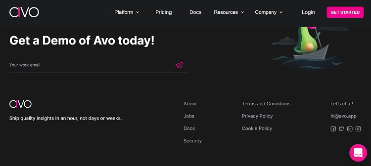
Avo adds a small icon to the bottom right corner of each page with the live chat emblem. People know they can click on it as another method of communication with the brand. You can use a chatbot to answer common questions and train live agents to handle the rest and close the sale.
6. Sitemap
Your sitemap serves more than a single purpose. Although your site visitors may need it to go to a specific page, it also lets search engines know what content people can find on your site and may help with indexing.
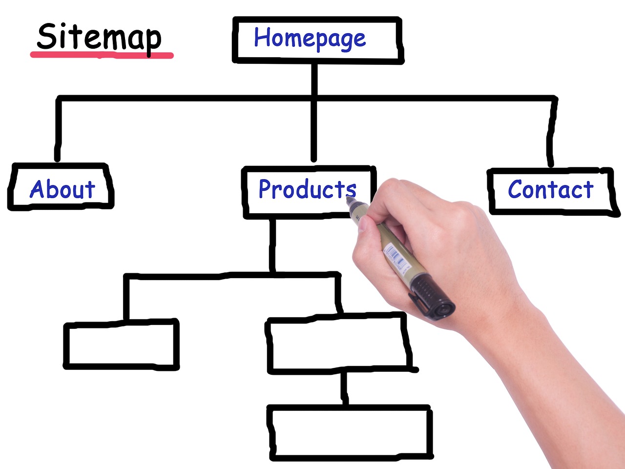
Image by fumingli from Pixabay
The sitemap also reminds you of the overall navigational hierarchy of your site and keeps you from adding unrelated content that doesn’t meet the needs of your target audience. A sitemap is an excellent addition to any footer.
7. Logo
You already have your logo at the top of your page, but a great place to reinforce your brand image is in the last thing on your page. The footer offers plenty of open space to include a small emblem showcasing the face of your company.
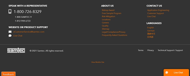
Samtec adds their logo to their footer next to their copyright notice. You can find all the policies and terms in the same area along with their support link. Note how the logo is smaller than what appears elsewhere and all white rather than orange. The image still reinforces their branding.
What Do Your Clients Need?
Think about the information your clients utilize the most. Heatmaps and thinking through customer questions may help you determine what goes in your footer.
Try different elements, test them to see how users respond and adjust things until you’re happy with your conversion rates and customer feedback.

Eleanor Hecks is editor-in-chief at Designerly Magazine. She was the creative director at a digital marketing agency before becoming a full-time freelance designer. Eleanor lives in Philly with her husband and pup, Bear.
