What makes a high converting e-commerce product page and why is it important?
Well, the goal of your e-commerce site is to bring in revenue for your online store. Driving traffic to your page is the easy part. Once you get people there, you have to sell to them.
And that is where the challenge lies…
Your product page is like a 24/7 salesperson representing your brand.
Like any salesperson worth his or her salt, you’ve got to ensure that it works hard to attract your prospects, persuade them that your product is worth its weight in gold, and convince them to take the right action. You should also make it a point to minimize any potential friction in the transaction process.
According to Statista, there are over 2.14 billion online shoppers. In the United States, around 80% of internet users will make at least one online purchase each year.
There is plenty of revenue to help you find success, but you need to prep your product pages for sales.
What is the magic formula that makes a product page sell itself? Here are the top things you can focus on along with some examples of e-commerce stores doing it right.
1. Motivate With Your Headline
Your headline must accomplish several things. You need to describe the product, including vital components such as size and color. However, you also must choose words triggering the user to take action.
Consider your headline may be the first thing a shopper sees when conducting a search or landing on your page. It needs to grab them in under two seconds and encourage them to read on.

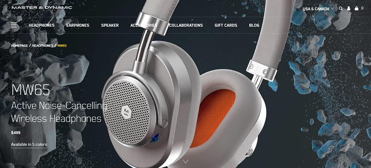
Master & Dynamic utilize strong action words for their headline on their MW65 product page. The headline reads “Active Noise-Cancelling Wireless Headphones.” They use the verb “active” and a single hyphenated word to describe what they do. They also work the word “wireless” in the mix to add some detail to the product.
2. Highlight Add to Cart Buttons
Are the “add to cart” buttons easy to find? Make sure you use a color that contrasts sharply with the background.
You want something to grab the user’s eye as they scroll down the page. You may want to add a button both above the fold and below the full description.
Give the user a couple of opportunities to add each thing to their shopping cart.
3. Make It Skimmable
People are busy. Many shop on their cell phones during a lunch break or between appointments. Make sure they can glance over the information and digest it quickly. While you want to include plenty of content, you can make it more readable by cutting unnecessary words and using subheadings and bullet points.

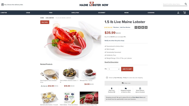
Maine Lobster Now uses checks as their bullet points. They tick off the advantages of their lobster, including guaranteed alive, wild-caught, sustainably harvested and antibiotic free.
There is a more in-depth description for those not in a hurry, but these key points jump out when scrolling for a quick read.
4. Allow Customer Reviews
People are much more likely to trust the feedback of their peers than anything you have to say about your product. Leave room for customers to add feedback. Make past reviews easily accessible.
Use a start system to show the averages, but allow people to click through for more detailed tips.
If someone leaves a negative review, respond immediately. Attempt to fix the issue and post how you’ll avoid something similar in future.
What processes did you change as a result of the poor review? If people see you genuinely care and rectify any problems, they’re much more likely to trust you with their money.
5. Add High-Definition Photos
E-commerce stores have the disadvantage of lack of touching and observing an item up close. Try to show each product from different angles. Think about all the details people want to know before buying and highlight them in images.
Hire a professional photographer to take product photos, so they pop. You want to avoid poor lighting and harsh shadows. The background shouldn’t distract from the inventory.

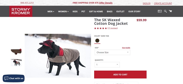
Stormy Kromer sells clothing and pet accessories. They use an image of the product and a photo of a model wearing the item. In both images, you can scroll over sections to zoom in and get more detail. Want to see how the dog hat attaches? Simply zoom in to see where the canine’s ears go and what it looks like on an animal.
6. Answer Frequently Asked Questions
Your product description should answer any questions customers may have asked about the product. Rather than taking up the resources of your live chat agents, list out the details based on questions.
You should also know the reasons people seek out a particular product to start with.
If you’re selling coffee frothers, perhaps the high cost of driving through corporate coffee shops is hitting your audience’s pocketbooks hard. You can highlight how a frother lets them make their own drinks at home and save money.
Think about the many benefits of using whatever the item is:
- Why is your selection better than competitors?
- What unique value proposition do you bring that no one else does?
- How do you manage returns or warranties?
- What are your delivery or shipping costs like?
All of these elements must be summarized for your product page.
You want to be detailed but keep it short and quick. Cut and edit until you have the best version of a description possible.
7. Ask for Feedback
Your customers are your best source of information for how to improve your product pages. If someone abandons their shopping cart and you have their email, shoot them a survey to find out why they chose not to buy at this time. For example, perhaps the shipping costs were more than they wished to pay.
The more information you gather from your regular customers, the better you can serve them through your product pages. Keep tweaking and improving until your conversion rates are what you want them to be.

Eleanor Hecks is editor-in-chief at Designerly Magazine. She was the creative director at a digital marketing agency before becoming a full-time freelance designer. Eleanor lives in Philly with her husband and pup, Bear.
