Wish to double or triple the effectiveness of your digital marketing efforts? Start by improving the conversion rate of your online channels.
And the first place you need to start with is your website—the most important piece of digital real estate for your company.
But how can you tap on Conversion Rate Optimization (CRO) to build a winning website? What are the tools which you should use, and the steps you should take?
To learn more about this emerging topic in digital marketing, I read Dr Karl Blanks and Ben Jesson’s solidly practical book Making Websites Win – Apply the customer-centric methodology that has doubled the sales of many leading websites. Founders of the highly lauded company Conversion Rate Experts, these are the same guys who CREATED the term Conversion Rate Optimization or CRO!
The book was a treasure trove of knowledge. It made me think deeply about how my websites and my client’s websites should be built.
In this article, I will share with you some of the key insights I’ve gleaned from the book, as well as some immediate techniques which you can use to kickstart CRO efforts for your own website.
What is Conversion Rate Optimization (CRO)?
First, you need to know what your Conversion Rate is. This is the percentage of your visitors who hit a certain goal after going through a content on your channel.
Your content can be a landing page, checkout page, explainer video, or email, while your goal can be for visitors to fill in a form, spend a certain amount of time on the page, download a guide, or place an order.
To increase your conversion rate, you can use what’s known as A/B Testing to ascertain which elements of your website are doing well (and which sucks).
From this, we can define Conversion Rate Optimization as follows:
Conversion Rate Optimization: The art and science of using a variety of techniques and tools to improve the conversion rate of a website, email, social media page, or other marketing channel.
Why Conversion Rate Optimization Works

So what’s the big deal about CRO? Well, there are several benefits that I learned from the authors:
- Conversion Rate Optimization converts more of your visitors into customers.
- Increasing your conversion rate can increase your profits more than growing your topline revenue
- CRO can improve traffic to your website
- Few companies use CRO techniques—hence you’ll enjoy a first-mover advantage!
Just look at this formula to see how it could significantly increase your online profits:
Visitors x Conversion Rate x Customer Lifetime Value = Revenue
DiPS: A Three-Step CRO Technique
I love the DiPS method proposed by the authors, which goes like this:
DiPS = Diagnose ➜ Problem ➜ Solution
(Yes, it is as simple as that!)
By adopting this empirical method to analyse your website gaps, DiPS helps you to be more focused and targeted when you roll out improvements.
Let us now look at some of the highlights of these areas.
How to Analyse Your Website Problems
There are literally thousands of tools and techniques which you can use to diagnose your conversion problems. We will cover the more significant ones here.
#1 Web Analytics

Google Analytics is the key tool here, but you can also use others like Adobe Analytics, Webtrends, Quantcast Measure, Kissmetrics and more.
These show you how much traffic you’re getting, the different sources of traffic, their behaviours on different pages, the demographics and interests of your users, their progression through your marketing funnel, and a whole lot of other useful data.
#2 Click Maps/ Heat Maps

Courtesy of Hotjar
These can reveal where visitors are clicking on your website, how far they scroll down each page, and other useful data using what’s called a heat map.
Tools here include Crazy Egg, Hotjar, Clicktale, and others.
#3 Session Recording Tools
These can track how users move between pages. They can also capture visitor’s keystrokes and mouse movements. Tools here include Clicktale, Hotjar, SessionCam, Mouseflow and others.
Watch the video below to see how you can use a tool like Hotjar to do a session recording of your web visitor’s actions on your website.
https://www.youtube.com/watch?v=-X8gokl5PWY
#4 Form-analytics Software

Courtesy of Formisimo
These track the success of your different forms, like:
- No of visitors which land on each
- Percentage who dropped out with each field
- Time spent on each field
- Fields that are left blank
- Error messages
Tools here include Clicktale, Hotjar, and Formisimo.
#5 Conduct a Survey
Asking the right questions is useful. Try the following questions on your website:
- “How likely are you to recommend us to a friend?”
- “If you could have us create something just for you, what would it be?”
- “What other products and services should we offer?”
- “What would persuade you to use us more often?”
- “What nearly stopped you buying from us?”
Tools for surveying include SurveyMonkey, Google Forms, Typeform, Clicktools, and others. For on page or exit surveys (from your website), consider using tools like Qualaroo, Hotjar, PopSurvey, Informizely, and others like them.
#6 Be a Customer or Salesperson (aka Method Marketing)

Consider becoming your customer (or your client’s customer) for a day or a week. Doing so helps you to understand the pains and problems which they encounter as you seek to fulfill a specific task.
The other way is to try to sell the products in person. While doing so, you can draw up a spreadsheet of objections and counter-objections which can later be used for your website redesign.
#7 Do a User Test
This is probably one of the oldest techniques in the book, and is probably familiar to most web developers.
The key thing here is to record your user test either through a screen recording tool (eg Camtasia, Jing, UX Recorder) or by recording how your user reacts while navigating your website.
#8 Study Your Competitors
Yep, this is what I normally do when I help my clients to build their websites.
Identifying Website Problems and Solutions
Consider yourself an online plumber—your role is to diagnose the ‘blockages’ using the tools and techniques above, and then rectify them here.
#1 Improve Web Writing and Copywriting

Badly written websites are a bane of CRO experts and content strategists alike. I’ve written extensively on this topic, so I’ll only highlight the salient points here:
- Readability tests—write like how they read
- Write like how you speak—keep your copy conversational by recording yourself and transcribing it
- Short and succinct—keep your sentences short. Minimise distance between start of subject and end of the verb. Omit needless words.
- Use tools to check language—popular ones include the Hemingway app and Grammarly
#2 Make Your Website User Friendly
There are numerous ways to design pages that are easy to use, and this include running usability tests and tools for wireframing and prototyping.
#3 Clear Value Proposition

Craft a buyer-centric value proposition, which is contained in your product description. Be as definitive as possible—do not waffle or over-generalize.
List all the elements of value that your visitor will get, and check that they are communicated clearly on your website.
#4 Amazing and Unbeatable Offers
Great websites have offers that visitors cannot resist from acting on. Here, you’ll need to consider your pricing strategies as well as your offer strategies. Depending on your product or service, they can be through an initial free trial, a discount, a sample, premiums, an ongoing monthly fee, or other combinations.
#5 Build Trust

In an increasingly scary online world, trust is critical. There are several ways to build trust here:
- Include reviews and testimonials—especially from authorities and experts
- Supply data and statistics to back your claims
- Use demonstrations to show how your product works
- Social proof through using the names of your clients or the numbers of them
- Associate your brand with a celebrity (this can be expensive though)
#6 Remove Risk through Guarantees
Incorporate risk reducing mechanisms on your website. This can be through guarantees and warranties.
To make it work, ensure that your guarantee gives customers the benefit they desire, offsets their risks (often financial), have a name, has a long claim period, is easy to invoke, and has no strings attached.
#7 Simplify Complex Processes

If your conversion process is more convoluted, the authors propose that you adopt an 8-step approach:
- Manage your visitor’s objections with your counter-objections
- Use as much copy as you need (try to reduce how many words you need, by reducing the commitment. And then use as many words as you need.)
- Use persuasive copywriting through the “separation of concerns“—this entails breaking up each detail in your web architecture so that visitors do not get lost. Treat each component separate from the rest.
- Make it clear where one module ends and the next begins
- Optimize navigation to match user’s understanding and intuition
- Label your modules clearly and descriptions that they can understand
- Use “progressive disclosure” to move your visitors forward (and prevent abandonment). See example in the image below.

Courtesy of UX Planet
- Include a fallback option like a search bar for visitors who can’t find what they want
(The book has a tonne of very useful methods to consider for each of these steps: go get it to learn what they are!)
#8 Choose Right Niches
This is probably more of a business strategy and less of a website strategy. Still, the principles are useful to consider.
One of the ideas here is to provide a subset of features that some customers love. This could be a restricted range within a broader category (like anti-dandruff shampoo).
You can also target a particular group of customers, for example, start-ups or individuals who need a specific service. Or consumers who are into vegan keto diets for their pets!
A key thing is to look for opportunities that you can seize without a struggle, and that your competitors won’t be looking at.
#9 Grab and Keep Their Attention

Great websites are able to keep the attention of their visitors. This can be done through various strategies:
- Memorable Name: Good examples include SurveyMonkey and perhaps Cooler Insights?
- Entertaining Message: Dollar Shave Club is a great example here. Their website and videos are always entertaining yet relevant to their customers.
- Offer no-brainer deals: Get your visitors to subscribe to your email list, or follow you on social media
You can read more about attention grabbing and retention strategies here.
#10 Make It Urgent

Yep, scarcity is one of the triggers of action on a website, and you should use the techniques that travel websites like Booking.com and Hotels.com use.
There are some ways to build scarcity into your offers:
- Have a deadline
- Provide an early bird special for early responders
- Limited places or stocks
Conclusion
What I’ve covered here are just the key points for CRO. You should get a copy of the book Making Websites Win to dive into the design details.
Naturally, CRO is a huge topic since it covers not just design but copywriting, human psychology, and User Experience (UX) and User Interface (UI) issues too.
There are a lot more which you can do—check out these articles I’ve written in the past about designing a winning website, building a winning landing page, and optimising your wordpress website for SEO.
Now that you’ve read these pointers about building a successful website, my question is this:
Which of these techniques would you use? And how would you implement them?
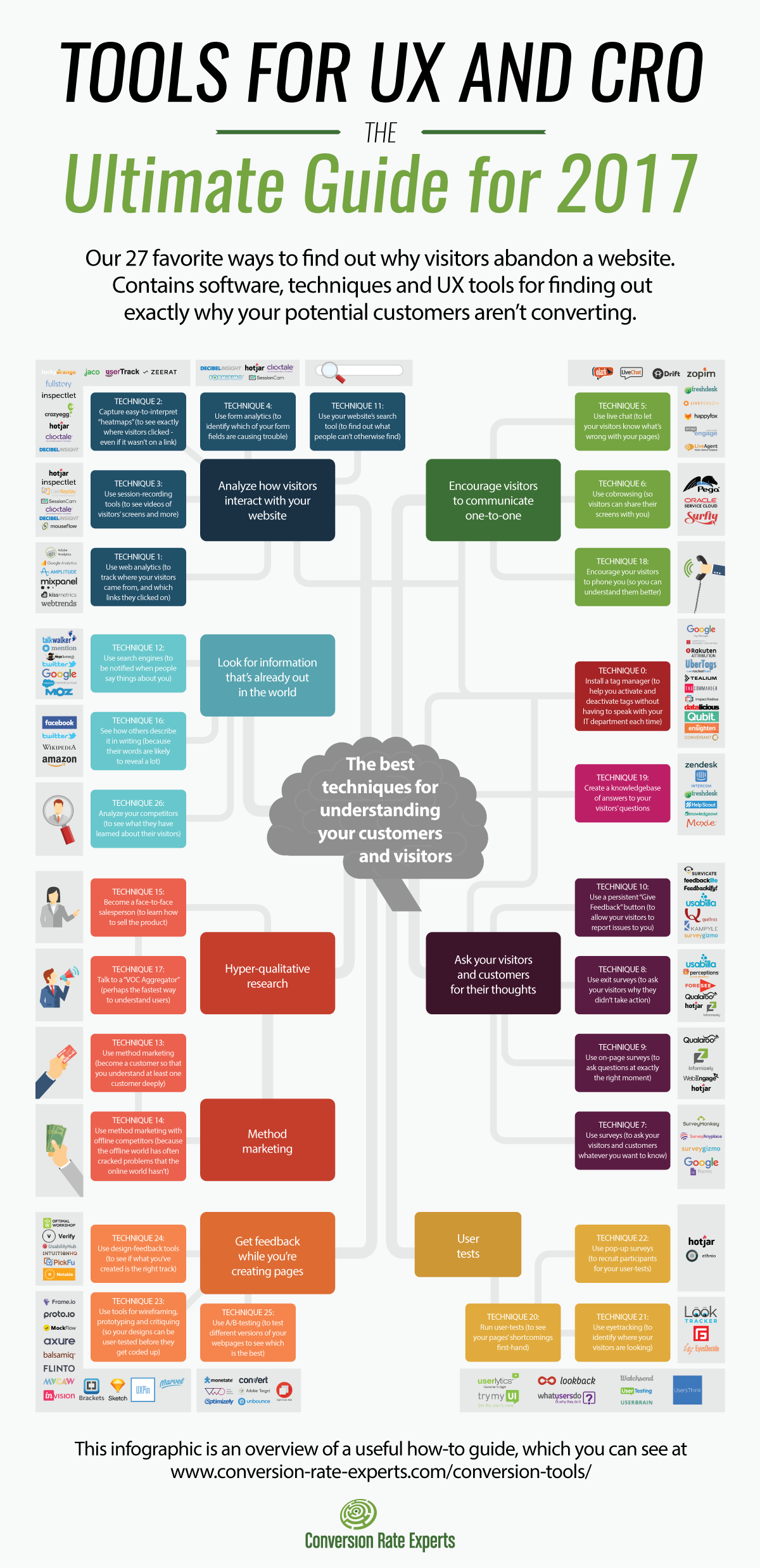
PS – Check out this infographic from Conversion Rate Experts which shows you the tools needed for conversion.


I am very impressed with your post because this post is very beneficial for me and provide a new knowledge to me
Thanks for sharing such useful information. It was of great help.