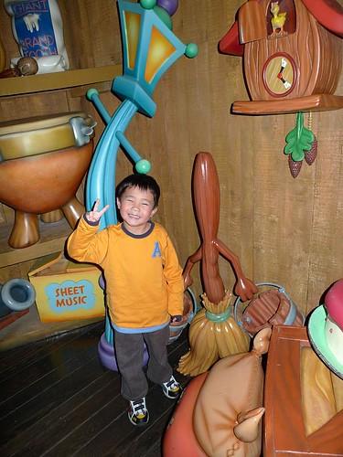
Disneyland provides lots of photo opportunities for kids!
Thanks to Bob Rogers, I recently learnt about the 10 rules of theme park design which were created by Disney legend Marty Sklar, Vice Chairman and Principal Creative Executive of Walt Disney Imagineering. These rules are designed to help anybody developing or designing a theme park to create memorable experiences for their guests.
So what are these precepts modelled after the “happiest place on Earth”?
?
1) Know Your Audience
This is probably the most straightforward commandment. Indeed, it is important for one to know exactly who one is gunning for, and to be as precise as possible in reaching this target.
2) Wear Your Guest’s Shoes
Pick a crowded weekend, park along with everybody else, buy your own ticket using your own money, stand in the queues, and eat your own park’s food. This will give you a deep insight into what your customers face, and how you can improve things for them.
3) Organise the Flow of People and Ideas
Look into the way people move around and what they encounter from point to point. Make it meaningful for them.
4) Create a Weenie (a Visual Icon… not what you’re thinking of!)
Try to minimise the use of arrows if you can as every arrow is a failure in design. Instead deploy visual icons to move people from space to space.
5) Communicate with a Visual Literacy
Use good design elements like font, icons, colour and shapes to get your message across.
6) Create Turn-ons but Avoid Overload
Find ways to stimulate your visitors at various junctures in the park, but avoid overkill with too many things to look at or do.
7) Tell One Story at a Time
As Rogers has shared, Stephen Spielberg was famous for saying “one shot one idea”. Similarly, one could limit it to “one room one idea” or “one ride one idea”, avoiding the cacophony of different messages.
8) Avoid Contradictions
Consistency is key in good thematic design.
9) An Ounce of Treatment, a Tonne of Treat
Occasionally, make your visitors work hard through a particular experience and reward them with a treat at the end which makes it all worth it while juicing up their endorphins.
10) Keep It Up and Maintain It
An attraction with fading paint, litter, or broken rides, is a bad attraction.
Oh wait, Rogers added one more bonus commandment (number 11) of his own creation, which says…
11) Give People a Photo Op
A photograph of a wonderful time at a themed attraction speaks far more than a 1,000 words. Create as many opportunities for your guests to take great photos and they’ll remember and love you for it.

thanx now i have the link which i was looking for my research.
steve jobs 10 commandments | dissatisfaction at work