In a city like Melbourne where the streets are often chock full of people, it is important for brands to invest in outdoor marketing to gain visibility, awareness and affinity, especially those targeting end consumers. Depending on the objective of the advertiser, these can be highly brand-oriented without any calls for action or be tactical and hard-selling if they are focused on specific groups.
Due to the limited amount of time which one has to glance at them, outdoor advertising creatives and messages must be immediately impactful and to capture one’s attention in the blink of an eye. They should be easy to digest and readily appreciate by the (literally) man-in-the-street. Creatives that are too visually cluttered or that contain too clever messages tend to get lost in the sea of images, failing to resonate with one’s potential target audience in a highly competitive market.
Here are some advertisements that I came across recently while taking a walk through the city. Do feel free to give me your views on whether they work or don’t work for you.
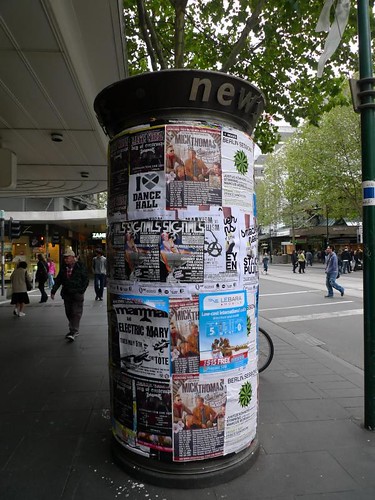
I wonder if anybody will notice posters like these which are rather unceremoniously pasted onto a column. Most of them were downright tacky and the way they are certainly an eyesore in an otherwise beautiful city. The posters are also pretty self serving and look more like notices with information on them rather than serious attempts to reach the public.
 These huge outdoor banners are placed along the densely populated Flinders Street. It is pretty obvious which ad will capture your attention more readily than the other! Once again, outdoor ads should refrain from using images that are too cluttered with unreadable text that are too tiny to make an impact from far.
 I think these beverage ads work better as the value proposition is clear. The use of the 4 deg C “LCD display” (yes, its fake) at the side is also a clever tactic to draw people’s attention.
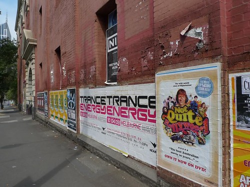 While the location of these banners at ground level gives them an immediate advantage, the peeling walls on which they are placed isn’t exactly very aesthetically pleasing. Then again, perhaps the brand identity of these activities and events – grassroots-oriented, underground, edgy – mandate that they seek unconventional channels for advertising.

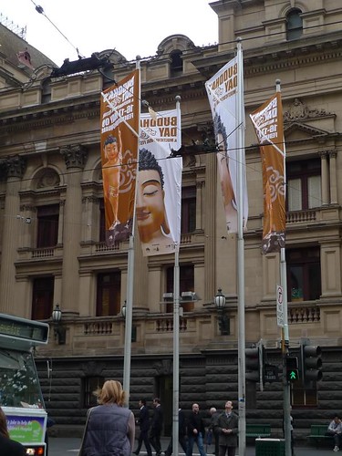
Another example showcasing the flagpole banners in action, this time of the recently concluded Melbourne International Jazz Festival. While the copy for these were easily read from ground level, the visuals used were less striking than the earlier example.
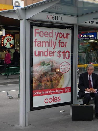
Here’s a tram stop poster advertisement with a marketing message that really hits home. It contains a highly relevant message in times of economic recession and the advertisers obviously know that their target audiences are more likely to take public transport than to drive.

Hi Walter, thanks for sharing this information on the vibrant outdoor advertising scene in Melbourne. We can also see most of them in Singapore. Perhaps not so much of the peeling walls (you need to look for them a little harder in Little India) and, we need to get “permission from the Police” for putting up unofficial Rent-a-Home advertisements in the bus stops.
Nothing adds personal flair like some outdoor banners. Thank you so much for sharing. Great photos!
Thanks for the post. You should take part in a contest for one of the best blogs on the web. I outdoor advertising will recommend this site!